


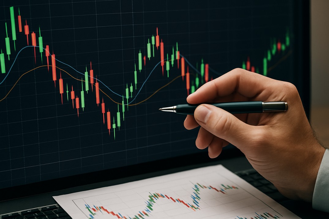
You’ve probably opened a crypto exchange and gazed at a chart littered with red and green bars, feeling a bit confused. Those bars can seem overwhelming at first glance—like a mysterious code known only to experts. But the reality is, candlestick charts (yes, that’s what they’re officially called) are one of the easiest and most effective tools for making sense of crypto prices. Once you learn to use them, you’ll be able to determine if buyers or sellers are dominant, identify trends, and even hazard a guess as to when a coin might increase or decrease.
What is a Candlestick Chart?
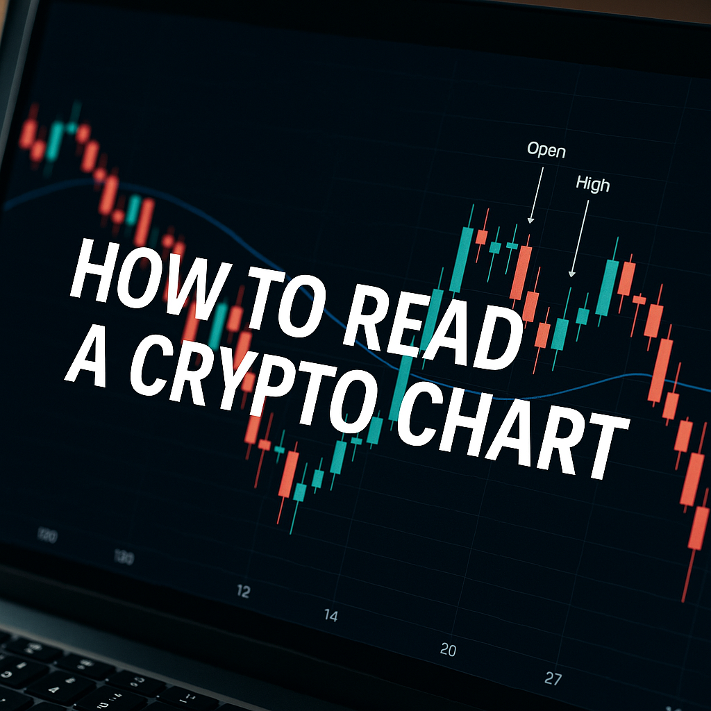
Suppose you are interested to know how the price of Bitcoin moved within a certain period—e.g., the last 1 hour or 1 day. Rather than presenting one plain line, a candlestick provides you with a history of what occurred within that time.
Every candlestick contains four main points of data:
- Open: The price when the time period commenced.
- Close: The price when the time period concluded.
- High: The peak price achieved.
- Low: The bottom price achieved.
That’s it. Four numbers became a visual candle.
Anatomy of a Candle
A candlestick is divided into two:
- Body: The fat part in the middle (between the open and close prices).
- Wicks (or Shadows): The thin lines above and below the body (indicating highs and lows).
If the body is green (or white), that indicates the closing price was higher than the opening price. In plain words, the price rose.
If the body is red (or black), then the closing price was less than the opening price—the price fell.
So by a quick look at colors, you can tell if buyers (green) or sellers (red) emerged victorious during that interval.
Selecting the Correct Time Frame
- Crypto charts enable you to define candlesticks to span various time periods: 1 minute, 5 minutes, 1 hour, 1 day, 1 week, etc.
- If you’re a day trader, you may consider 1-minute or 15-minute candles.
- If you’re a long-term investor, daily or weekly candles are more suitable.
Keep in mind: A 1-hour candle is illustrating the battle of only one hour between buyers and sellers, whereas a daily candle is revealing the whole day’s battle between buyers and sellers.
Common Candlestick Patterns (Made Simple)
Candles not only indicate prices, but also create patterns that suggest what is likely to happen next. Here are some easy-to-use ones:
- Doji: The body is extremely thin, nearly a line. It indicates the buyers and sellers are equally powerful—usually a signal of uncertainty.
- Hammer: A short top body and tall lower wick. It resembles a hammer and most often indicates that sellers attempted to drive the price lower, but buyers resisted. This could signal an impending price bounce.
- Shooting Star: Reverse of the hammer—smaller body at the bottom with larger upper wick. Indicates buyers drove price up but the sellers took over. Usually a sign of a potential fall.
- Engulfing Candle: Large green candle completely engulfs previous red one (or vice versa). Indicates a strong change in momentum.
These patterns don’t predict the future, but they provide indications about the psychology of the market.
Trends and Support/Resistance
It is good to look at single candles, but the greatest strength comes in seeing trends.
A string of green candles? The buyers are dominant (uptrend).
A string of red candles? The sellers are dominating (downtrend).
Candles also assist you in recognizing support and resistance levels:
- Support: A price point where the buyers continually jump in and prevent the price from decreasing further.
- Resistance: A point where the sellers typically show up and prevent the price from going higher.
Consider support as the floor and resistance as the ceiling of a room. Candlesticks indicate to you when the market continues to bounce off these levels.
Beginner Tips
- Don’t Make It Complicated: Begin with only knowing about red and green bodies. Patterns can come later.
- Zoom Out: Don’t be stuck on 1-minute candles. Always take a look at longer time frames to see the larger picture.
- Use with Other Tools: Candlesticks are strong, but add indicators such as Moving Averages or RSI for more robust analysis.
- Practice First: Most exchanges and platforms (such as TradingView) allow you to view charts live. Practice interpreting candles without risking money.
Final Thoughts
Candlestick charts are not as esoteric as they appear. They’re just a graphical representation of human emotions—fear, greed, hesitation—using price action. The more you learn to read them, the more they begin to sound like one of those languages that somehow seem to make sense immediately.
Tnews
Whether it\'s breaking news, expert opinions, or inspiring athlete profiles, your blog delivers a winning combination of excitement and information that keeps.
Tnews
The way you seamlessly blend statistical insights with compelling storytelling creates an immersive and captivating reading experience. Whether it\'s the latest match updates, behind-the-scenes glimpses.